Text Rain Sketch with Processing
This Processing sketch is derived from Camille Utterback's Text Rain project where a video feed allows users to interact with letters falling from the top of the screen like rain. It is the first project of the CSCI 4611 - Programming Graphics and Games class offered as an elective for computer science students at the University of Minnesota. It's primary purpose was to introduce students to rendering loops and how to update and maintain graphics between frames, but it gave us the opportunity to test out custom controls as well.
Project Requirements
This is the list of requirements that students were given to help guide them as they progressed through their project. This was a great help for us because it gave us a concrete structure to follow with no questions on where our projects stood. It also gave us ideas for how to improve our projects.
- C requirements
- Draw video frames to the screen (basically already done by the support code).
- Load a font into Processing.
- Use the font to draw characters on the screen so they show up on top of the video.
- Animate the characters, making them fall down the screen.
- B requirements
- Make the characters stop falling when they "land" on a dark object.
- Support interactive threshold adjustment for situations with different lighting conditions by changing the value of the threshold used to determine foreground and background objects interactively using the UP and DOWN arrow keys.
- Support debugging and setting a good threshold by displaying the results of the threshold computation – when SPACEBAR is pressed, toggle between displaying the final user view and a "debugging" view that shows a binary image for the foreground/background classification: all pixels classified as foreground should be pure black, all pixels classified as background should be pure white.
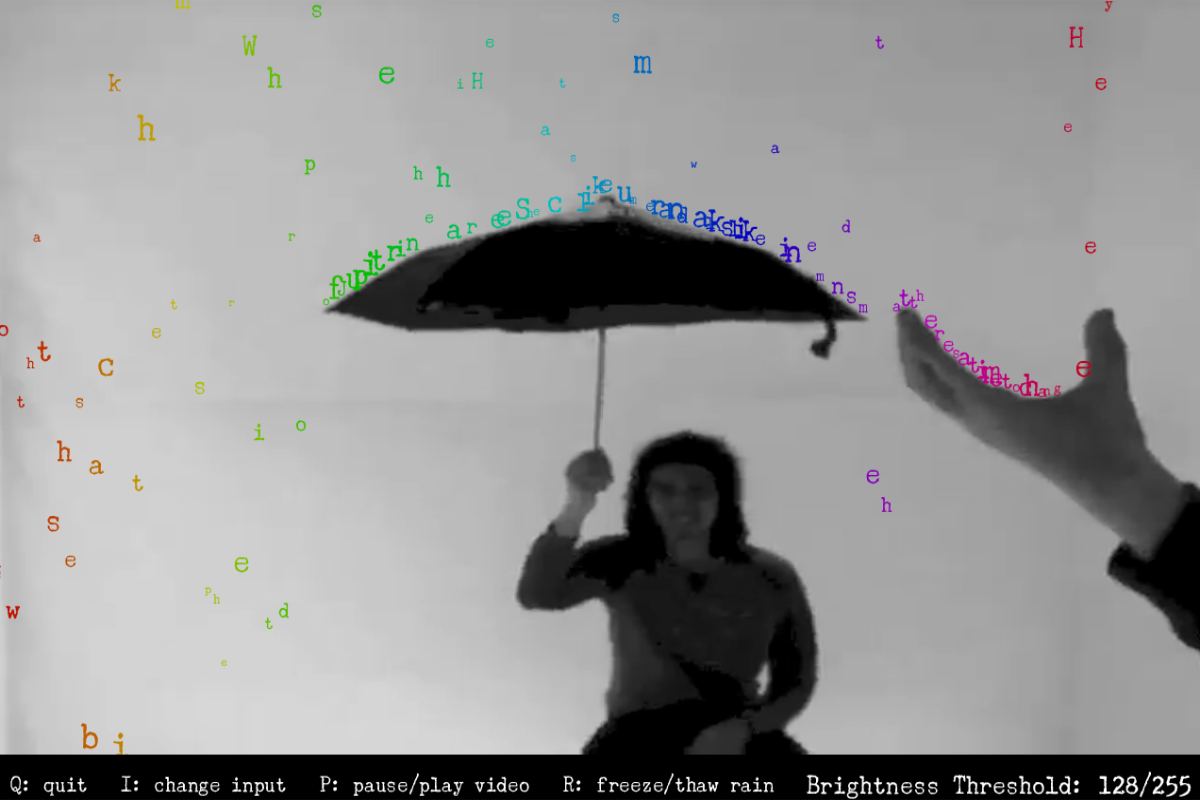
- As in Utterback’s implementation, display the video image in grayscale and the text rain in color.
- Flip the video image displayed on the screen so when viewers look at the display it looks like they are looking in a mirror at themselves. This must apply to both live video and pre-recorded video files.
- Pick characters to display (i.e., new rain to add to the scene) at random from some text that is artistically appropriate for the Text Rain theme.
- A requirements
- Make the rain falling algorithm "robust" so that rain doesn’t pass through black regions even if they are very thin (e.g., just a pixel wide).
- Make the rain falling algorithm "robust" so that rain doesn’t just come to a rest when it lands in the palm of a viewer’s outstretched hand but will also rise up with the hand if the viewer raises his/her hand.
- Use a useful, more sophisticated algorithm (you should come up with your own idea here and describe it in your README file) for picking characters to display at random so that the rain still looks random but there is a reasonable likelihood of catching (or seeing) a set of raindrops that spell out a whole word.
- Include some variation in the velocity of the raindrops to make it look a bit more interesting.
Comparing to the Original
There is a couple differences in this rendition to take note of:
- Utterback's original installation had multiple instances of the same letter falling in place. The letters here are more tightly packed, but only one copy will ever fall in a particular location.
- The colors of the original lettering are two-tone. Here they are a rainbow spectrum based entirely on where that letter is along the width of the frame. Who doesn't like rainbows?
- The falling letters in Utterback's version came to rest on top of whichever dark spot was in-line for that character, even if the character was already underneath the dark zone. By default, this one will do the same, but there is a setting that allows you to adjust this to be more reasonable. It's based on a percentage of the letter's hight, so smaller letters will escape easier, akin to sand.
- The text from Utterback's design was from a poem. For this version, you may be able to catch the first couple phrases from Train's song, "Drops of Jupiter".
One way that I'm sure our algorithms are similar is where the text is arranged along the width in a way that could be legible given the right conditions. The implementation in this version can be seen about line 20:
// Their x values are shifted to make it look a little more
//    natural. The shifting is minimal so words can still
//    appear legible.
frameWidth / phraseLength * i + random(-2, 2),
This chunk is in the middle of creating all the Letter objects.
In particular, this is for assigning the x coordinate or pixel column, where i is the index for the ith character in the phrase.
The random(-2, 2) adds a little bit of jitter to make the spacing feel slightly more organic, otherwise each letter's midline would be at a uniform distance form each other.
The randomness is also aided by another call to random() to assign a font size for that letter, which changes on every "lap" around the window.
This size not only changes the font, but also influences the velocity of each letter and a handful of other calculations.
What else is new?
A few keyboard interrupts were required as part of the assignment. Pressing the space bar will change the view to what the algorithm sees when deciding where to place a letter. All pixels on the canvas are turned to either black or white based on the current value for the brightness threshold. This value can be adjusted by pressing the up and down arrow keys. For the convenience of the uer, this is displayed in the bottom-right corner of the window. However, this is not the only value that can be adjusted.
Pressing the left and right arrow keys will allow the user to switch between several different parameters to be fine-tuned.
| Display Name | Default | Min | Max | Step | Description |
|---|---|---|---|---|---|
| Brightness Threshold | 128 | 0 | 255 | 1 | The minimum brightness that letters will land on |
| Frames per Lap | 250 | 100 | 500 | 25 | How many frames a letter is allowed to stay on the screen before returning to the top |
| Bounce Tolerance | 400 | 50 | 1000 | 5 | The percentage of the letter's hight to search for a shelf to sit on (how high will the letters "bounce" from a fast movement) |
| Minimum Font Size | 12 | 10 | 32 | 1 | The smallest size in pixels that the letters will spawn at |
| Maximum Font Size | 36 | 32 | 64 | 1 | The largest size in pixels that the letters will spawn at |
| Feed Width | 1280 | 100 | 3840 | 20 | How far to stretch the incoming image horizontally |
| Feed Height | 720 | 100 | 2160 | 20 | How far to stretch the incoming image vertically |
Additionally, some other keybindings have been set.
| Key | Action |
|---|---|
q | Quit the sketch from either the menu or the video |
i | Change the video input method |
p | Pause or play the video input (the text will still fall) |
r | Freeze or thaw the text falling (the video will still play) |
Final Remarks
This was a highly enjoyable exercise that resulted in a great visual result. I was able to provide plenty of extensions to customize the simulation. The only drawback was that this sketch requires the Processing engine to run it. There are ways to make similar simulations through a web interface, which I may attempt in the future.
- Java
- Processing
- Simulated Physics